AOL Alto Mail
During my time at Aol I was a member of the UX mail team. A creative team consisting of two other UX designers and myself, have been working on re-imagining email. During this process I have been responsible for the visual design, UI collaboration and prototyping to help sell the vision to management and illustrate concepts to development.
Our first attempt was called Phoenix. After the beta release, it was obvious that it wasn't much of a disrupter in the space. The team went back to the drawing board and came up with Alto.
Since Alto has been released in beta, it has been well received by the industry and press. Fastco Design called it one of the 16 best ideas in UI design in 2003. Press reviews have been numerous, such as Fastco Design, Business Insider, and New York Times just to name a few.
This design took place during the time when skeuomorphism was all the rage. Our direction was to lean into the tactical quality of paper, letter press and cards.
Here is a walk through of some of my work as it relates to the evolution of Alto as a co-creator.
VISUALIZING AND SELLING CONCEPTS
I created these videos from UI concepts and wireframes. They were used as proof of concept and to vet ideas.
SELLING THE FEATURE VISION
One of the original features of Phoenix was the gobar. The user had the ability to send out short bursts of communication from IM, text, status or email. All done in one place. Since the wireframe concepts were hard to grok, I created an interactive flash prototype to help sell the idea for sign off. I included a movie example of the prototype.
Even though this was one of the main features that helped differentiate Phoenix from the competition, it never made it into Alto.
THE FIFTEEN-FOOT TEST
After Phoenix was built it went through user testing and press reviews. The overall feedback was that it didn't differentiate itself from the competition. So the team went back to the drawing board with the mantra of creating an email app that would be strikingly visually different.
DISRUPT
DEMONSTRATE CONCEPT TO BUILD
A walk through prototype was needed for internal presentations. Since the app was far from a state where it could be presented, I created a walk through of the conceptual features using Keynote. Here is a video of that prototype.
THE VISUAL DESIGN - TAKE TWO
Internal and external feedback from the first visual design indicated that it was way too gray; however, it was visually different than the competition. So I created a second design with the goal of addressing all of the feedback.
THE ALTO BETA RELEASE
Example of the sign in flow.
The users workspace.
Reading a message.
Conversation view in read
Quick compose for short bursts of communication
Full compose for when you need the added features
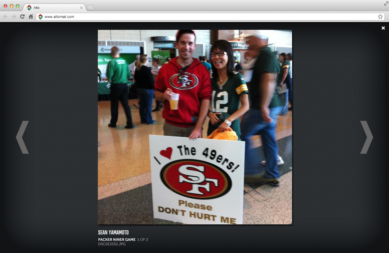
Photo stack helps bubble up the memories from the inbox
Gallery mode for passively consuming content from the inbox
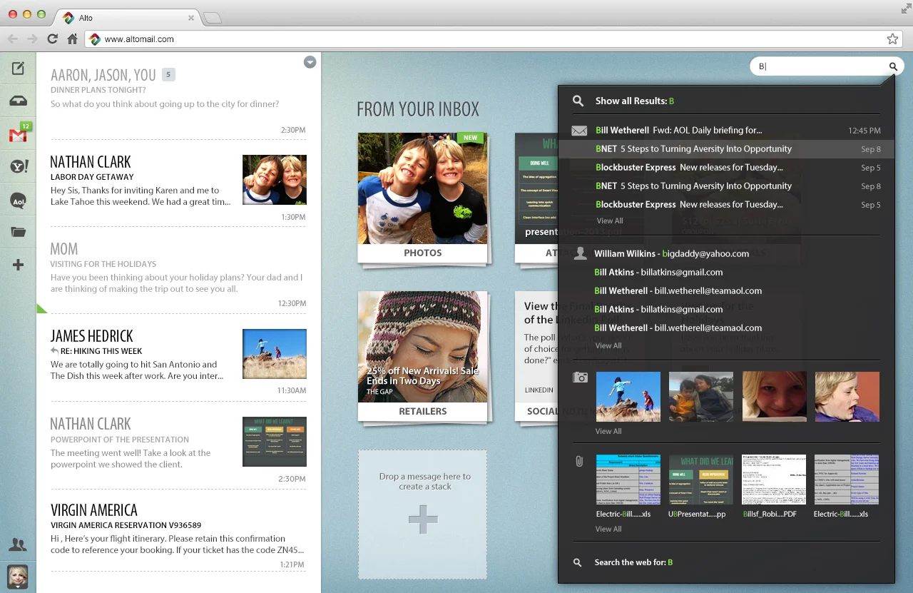
Spot light search which exposes the content from your inbox
Example of the search results
Contacts integrated with social services
Example of an individual contact
Example of retailers in reader view
Example of daily deals in tile view
Example of social notifications in message list view
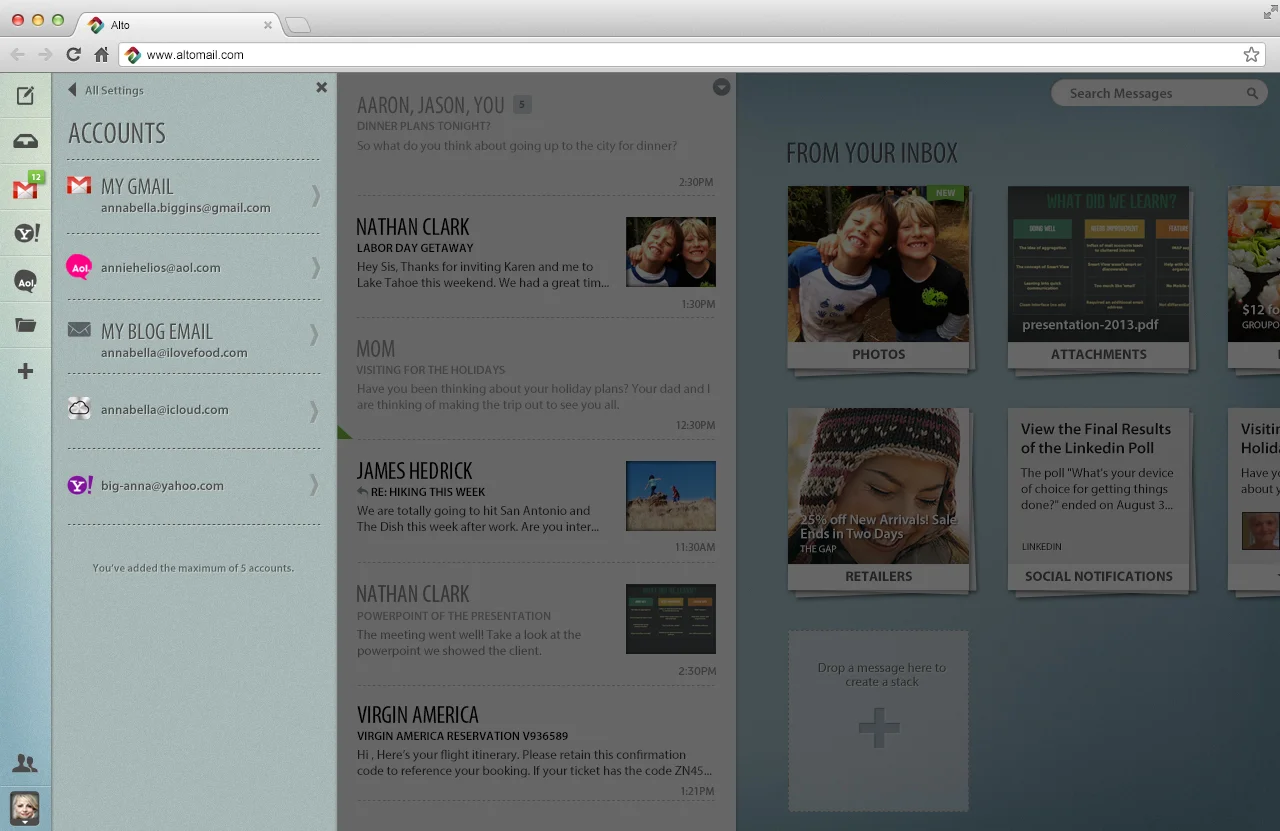
Message list slides to expose aggregation, folder tray and settings
CREATING THE BRANDING
Creating the Alto branding was challenging due to the fact that the competition marks own the space. Glowing, Malleable, fluid and Refreshing were keywords used to help define the visual direction of the branding. I first started off pencil sketching, sculpting from play-doh and looking at found objects that embodied the keywords. There were many iterations.
This is the final logo.
iOS home screen icon design
DESIGNING THE MOBILE APP EXPERIENCE
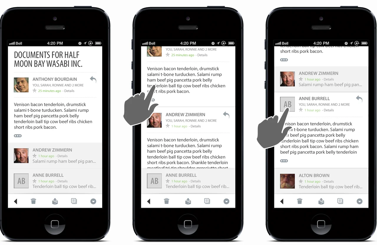
I am currently working on the design of the mobile app of Alto. The goal is to keep the same level of importance on the main features on mobile as the web app. Here are some high level screens from the design so far.
Visual design for conversation view in read
Visual design for reader view in the deals stack


