Ink Design System
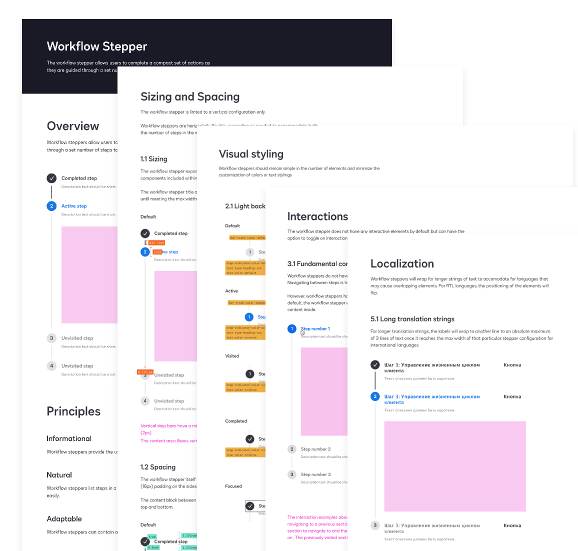
At DocuSign I led design initiatives in building a new design system from the ground up, called Ink. My team and I partnered with Front End Dev, User Research, Product Design, Accessibility, Localization and Brand teams in delivering components to help build top class product experiences. The business reason this work was needed was that the legacy system was a collection of components based on individual product needs with no governance or consideration on how they scale across all products. We also needed to align the company rebrand with how customers would experience it in product and creating a new modern system was the ideal way of accomplishing those goals.
My team spent one quarter designing and spec’ing roughly 30 components. We started with foundations including tokens, font scales, grids, icons, color palette etc. We utilized the following principles to help us stay unified and focused.
During this period we ran workshops with Product Designers sharing our approach, as well as vet our direction with their needs to insure we were designing what was needed. Our motto was to only design what we needed right now. We also had multiple check ins with Developers to insure our design approach matched how they would build components so that they could be as efficient as possible during development.
We delivered specs to the Front End Dev team and worked with them on design QA as they built the library.
As product areas adopted the system we refined existing components, as well as adding new components to the library ending with 60+ components to meet product expanding needs.
Adoption was slow at first. Teams were risk averse and lacked resources to implement. It was difficult to get Product Managers to put the work on their roadmaps as it was seen as taking away resources from building new features etc. To work through these challenges we started implementing Ink in product areas with low usage so we could learn and not cause harm to the companies bottom line. We ran a high level assessment of system readiness and adoption percentage per product area. We also had numerous presentations to educate and communicate the benefits of the new design system, such as accessibility, localization and how synergy between products can reinforce consumer trust.
I ran quarterly surveys to those using Ink to gather data on its effectiveness and efficiency which delivered the following results:
Workflow improvements:
Design reported 70-80% faster, 15-25 hrs time savings per week
Dev reported 60-70% faster, 10-20 hrs per week
Efficiency with library in Figma
Over 3 million inserts, roughly 28,000 detachments = 0.9% detachment rate or 99% efficiency rate
Satisfaction:
70-80% teams reported being highly satisfied with 4+ out of 5 score
With the system now on roadmaps and inroads made on adoption, I led the cross-functional team to begin planning our future roadmap to further mature the system. We focused on how we can support contributions back to the system, community and further ways to improve design and dev efficiency.
We developed contribution policies to encourage teams to create their product specific recipes out of Ink foundations. Check ins were established so product teams had a space to get guidance as needed.
To continue to help improve efficiency we created basic page templates to help designers get working faster. The future intention to have dev equivalents in code. In documentation we added patterns and accessibility guidance. We also added content in Figma, such as inspirational style galleries and usage best practices.
It’s been rewarding to see the transformation of product areas from having antiquated UI to now modernized and sharing unified experiences across product areas. Here are a few examples that show Ink in product.
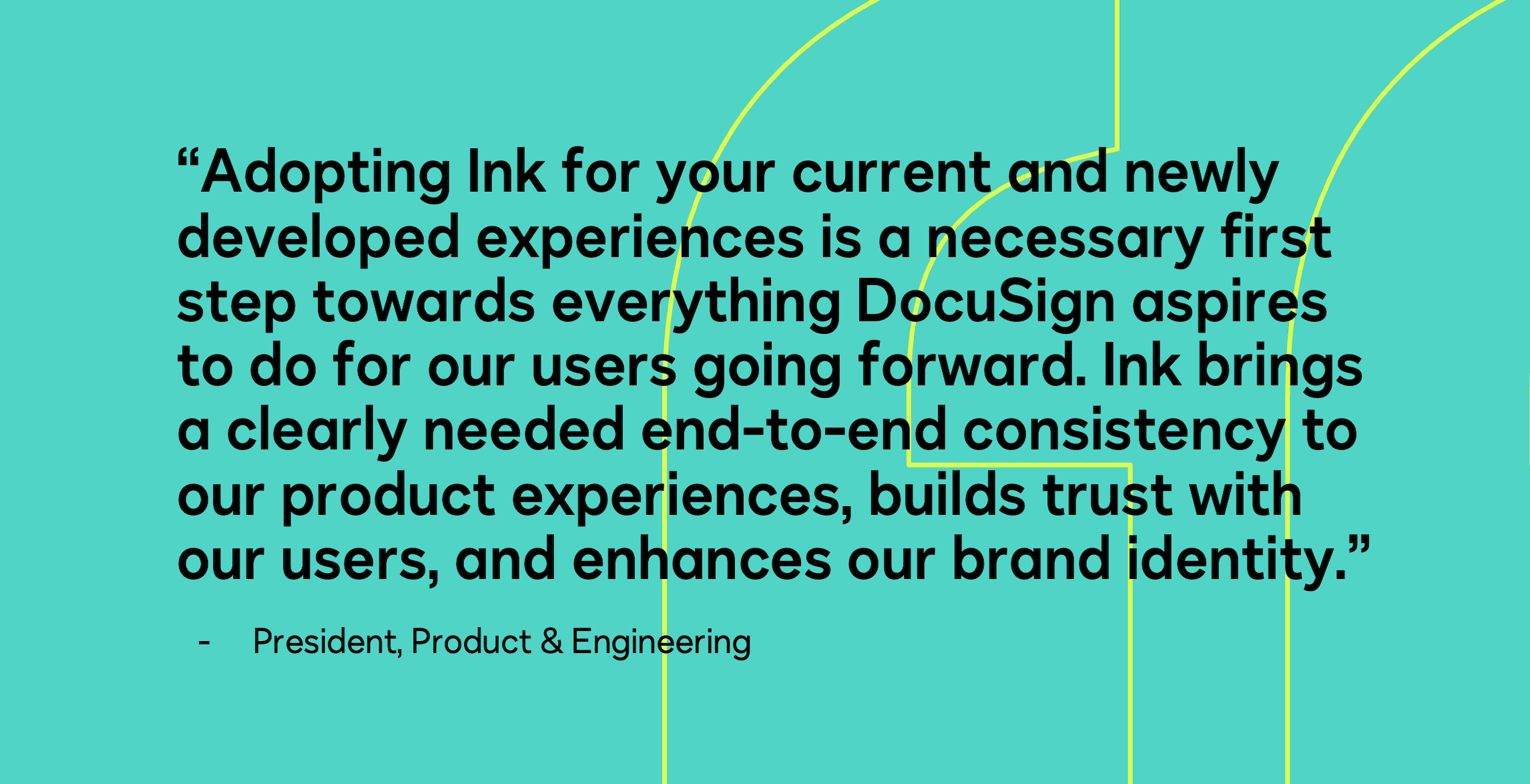
The cross-functional team interviewed PM’s, Developers and our acting President of Product & Engineering and they had these statements concerning the experiences and importance of using Ink.


