2014 LG WEBOS TV
While working at the LG Silicon Valley Lab. I was the Principle UX Designer on the Systems UX team building a WebOS Smart TV.
Since being officially announced at CES 2014 the TV has gotten lots of great press.
Gizmodo called it an awesome resurrection. Engadget expressed that it is the best smart TV UI they've ever used. Stories from the press have been numerous, such as Techcrunch, Stuff Magazine, Digital Trends, Trusted Reviews, and The Verge.
HOME
When I joined the LG WebOS core UX team, the interaction patterns and visual design were fairly well baked. That said, I did have influence on how Home was structured. The image on the left is the old Home and the right image shows the tweaks I made.
User testing and feedback from Korea helped to inform some design tweaks which included: moving the last input recent card viewable on Home, relocating the currently running app info to the top left and combining global controls with the clock.
RETHINKING CONTENT DISCOVERY
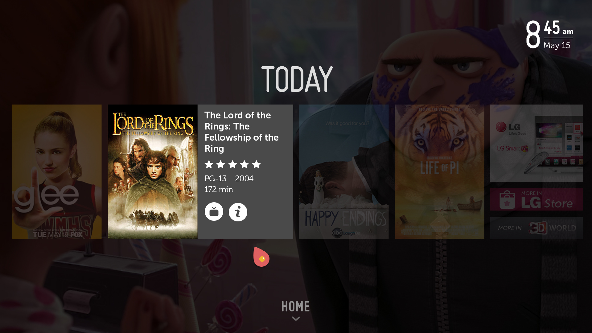
I was the UX lead on rethinking the existing content home that existed on LG TVs. The goal was to make it as lean back as possible. This was accomplished by eliminating the apps and focusing on just viewable content, minimizing the amount of content and utilizing the remote scroll wheel for browsing.
The image on the left is the old LG content boards. The image on the right is the new design.
Fist step was to sketch out my ideas. From there I tried to lay out the required items into a grid in many possible arrangements.
I explored many different layouts. Due to requirement differences between HQ and core UX, there were some options that included apps and many iab ad sizes.
PROTOTYPING
I created quick prototypes through the design process to vet and help sell my ideas. This was a very early prototype showing a user walk through with monetization in mind. It also shows how the user could paginate through content using the remote scroll wheel.
This prototype illustrates how the Today board and the Launcher would interact if the Home remote key was assigned to the Today boards.
It is also exploring how both items could peak from the edges.
This prototype includes many of the interactions that exist in the final product. The entry point is from the launcher, having home persistently go to the launcher.
FINAL MOTION/INTERACTION
This video shows the final animation of the interactions of version 1. The color masks were added to give the visuals more life and to hide the fact that the assets needed time to load.
Next steps was completing the UX documentation for engineering and Q/A.
EVOLUTION
There were design iterations and changes made to how the content info and service selection were displayed.
V1 dimmed back non desirable content with a simple overlay for content info. Upon user interaction, the available services are displayed.
V2 was reworked to accommodate possible video advertising in the content info flow. The content poster was removed to instead be used as a visual element in the background.
This is the final animation showing the interactions.
After the design was complete, I directed the motion designer on what the desired interactions and motion needed to be.
Next steps was completing the UX documentation for engineering and Q/A.
WEATHER APP DESIGN
I created these high-level designs for a weather app that was presented to AccuWeather. The goal was to illustrate how their app could function within the recommended app patterns and be more visually appealing.
ADDING FAVORITE CHANNELS INTO THE LAUNCHER
Another project that I was a lead on was creating a way for a user to add favorite channels into the Launcher. One requirement was that this needed to be a group/folder. Due to technical constraints the scope was reduced to just adding OTA channels. Further work is needed to included set top etc.
I sketched out possible ideas in solving the problem. From there I created visual iterations based off of those sketches.
PROTOTYPING
Here are a few of the prototypes I created exploring possible ways favorite channels could be displayed. This was a failed idea of having the channels fly out from the top of the group tile.
I explored how it would feel if this was fully modal in the launcher. It was quite jarring and I scrapped this idea.
This prototype has some of the interactions as the final design. The onscreen remote UI was removed.
FINAL MOTION/INTERACTION
After the design was complete, I directed the motion designer on what the desired interactions and motion needed to be.
This video shows the final animation of the interactions for adding favorite channels into Launcher. Requirements were reduced to just include interaction for the current channel user is viewing.
Next steps was completing the UX documentation for engineering and Q/A.


