2016 LG WebOS TV
The last project I worked on at LG was the 2016 WebOS TV. After the successful release of the 2014 WebOS TV, LG made experience and performance updates on the 2015 TV. In 2016 there was a marketing requirement that the UI be recognizably visually different, but yet still retain the look and feel of the existing WebOS visual language.
Along with two interaction leads, I was the visual design lead on the 2016 team. The Santa Clara team worked closely with our Korean design colleagues. The following is a walkthrough of the design process of the main features established for the 2016 TV.
UX and Feature Assessment
The 2016 team, consisting of design and product, kick started the design process by establishing what was successful previously, what were on going pain points and issues, as well as, new possible features.
The outcome from this exercise was categorized and narrowed down into pillars to focus on. The next steps included brainstorming and sketching out ideas.
Brainstorming and Sketching
Here are some of my brainstorm sketches from the focus pillars. After the team sketched, we presented our ideas to each other and debated on what ideas made sense from a feature, resource and reality stand point. The out come was to focus our attention on content discovery in three main areas that consisted of favorite channels and shows, as well as, populating the EPG with OTT content. My area of focus was on elevating favorite channels and shows into the main UI.
Concept Generation
The following are a few ideas I had for incorporating favorites into the main UI of the TV. These ideas are mostly flawed, but I wanted to show the process that led to the final design.
Idea #1
This concept revolved around the data we had concerning consumers want to navigate by content not apps. Considering this information, but yet understanding there are biz dev hurdles in approaching content discovery from a content first POV, this idea explores thinking about the UI as a left brain / right brain concept. The home UI could included top apps used and categories of content that a user could explore, navigating back and forth between both areas.
Idea #2
This concept explores using a long press on the magic remote which would invoke different launchers including apps, content and recent viewed items. On long press the user could use the scroll wheel to paginate through the different launchers on the Z-axis. The video below illustrates the concept.
Idea #3
This concept explores having favorited and/or recent content popping up when the app tiles are in focus. Below are a few videos that explore the possibilities on how this content could be presented.
Idea #4
One of the hotly debated items was wether we should remove recents from its current place in the launcher UI. There was strong data that users really found the last recent as valuable but they were using any later recents as a work around as favorites.
The following is a concept exploring if there was another area in the home UI were users could access recents. Considering the home UI displayed the currently open app in the top left, I was curious if there could be a queue of recently used apps behind the current app.
Favorite Shows Final Design
The following screens are the final visual design for favorite shows. The screens will walk through different states of the UI.
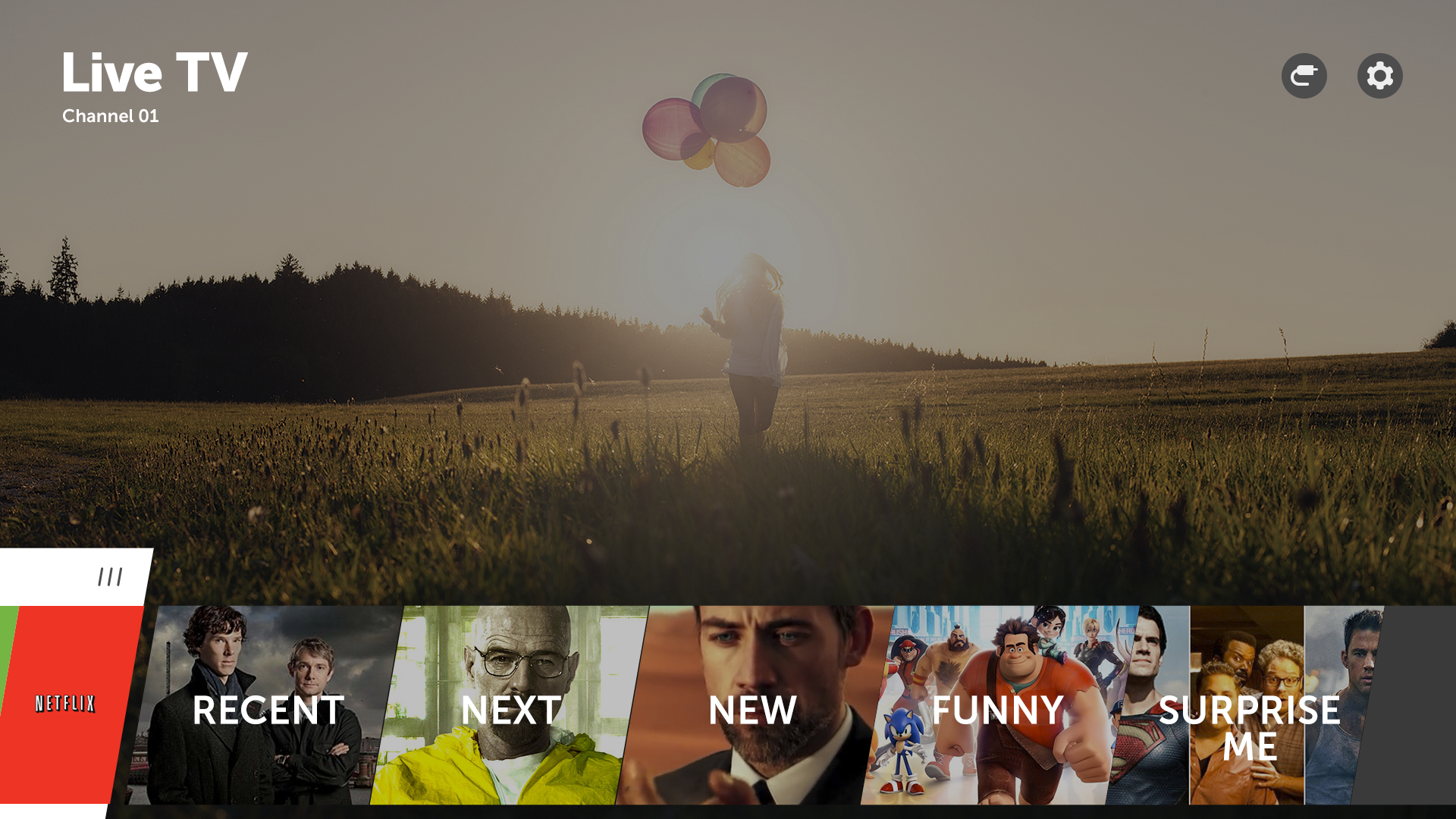
This is an example of what home looks like on first use.
This screen shows scrolling right though the apps and how favorite channels and shows movies off screen.
This screen shows the invoked modal edit state. This design was created to address the fact that edit mode was hard to find in previous years.
This is an example of the home screen after a user has added favorite shows.
This is the visual design for favorite shows after a user has selected it from the home screen.
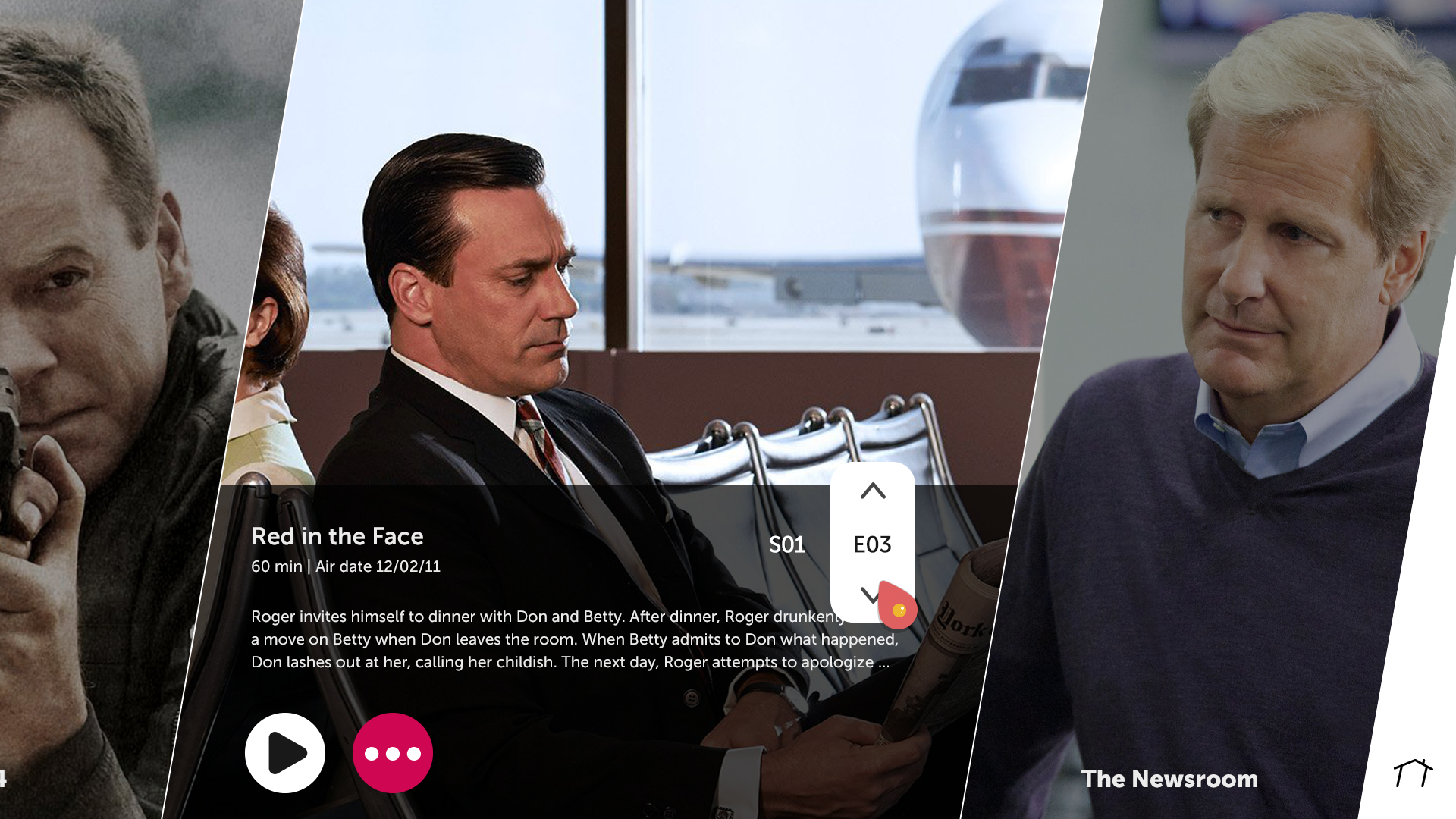
The example on the left is a show detail after a user has selected a specific show. The screen on the right is an example of how a user can select a specific season and episode.
On the left is an example of the empty state of favorite shows. The right is the first step in the process of adding a new show.
Once a user has selected the add affordance they are presented with recommendations and keyboard entry. Once show has been selected the next tile in line is populated with show art.
This is a walkthrough exploring how adding a show would work.
These two screens are examples of invoking edit mode, which follows the same interaction pattern as edit mode in home.
This is video walk through of favorite shows.
Favorite Channels Final Design
The following screens are the final visual design for favorite channels. The screens will walk through different states of the UI.
This is the first time experience, before any channels have been added.
This is a visual exploring how a user could select OTA channels.
This is a visual showing channels added.
These two screens show accessing edit mode. It follows the same interaction pattern as home and favorite shows.
This is video walk through of favorite channels.


