We started out taking the DocuSign brand values which were Human, Loved, Responsible and Transformational and aligning them with our interpretations of what would translate in product. We tried to unpack these values and sign atributes to help us visualize how they could inform possible directions. We later refined our version of values to become Confident, Essential and Alive.
We then created mood boards with images we thought reflected the essence of these atributes and then spot ranking those we thought were the most successful.
We organized the selected images into composed groupings. These groupings gave us four different potential directions. They were named Gentle, Spot, Pop and Braun.
After reviewing the four directions with stakeholders it was decided to explore combining Spot and Braun, which we called Poly
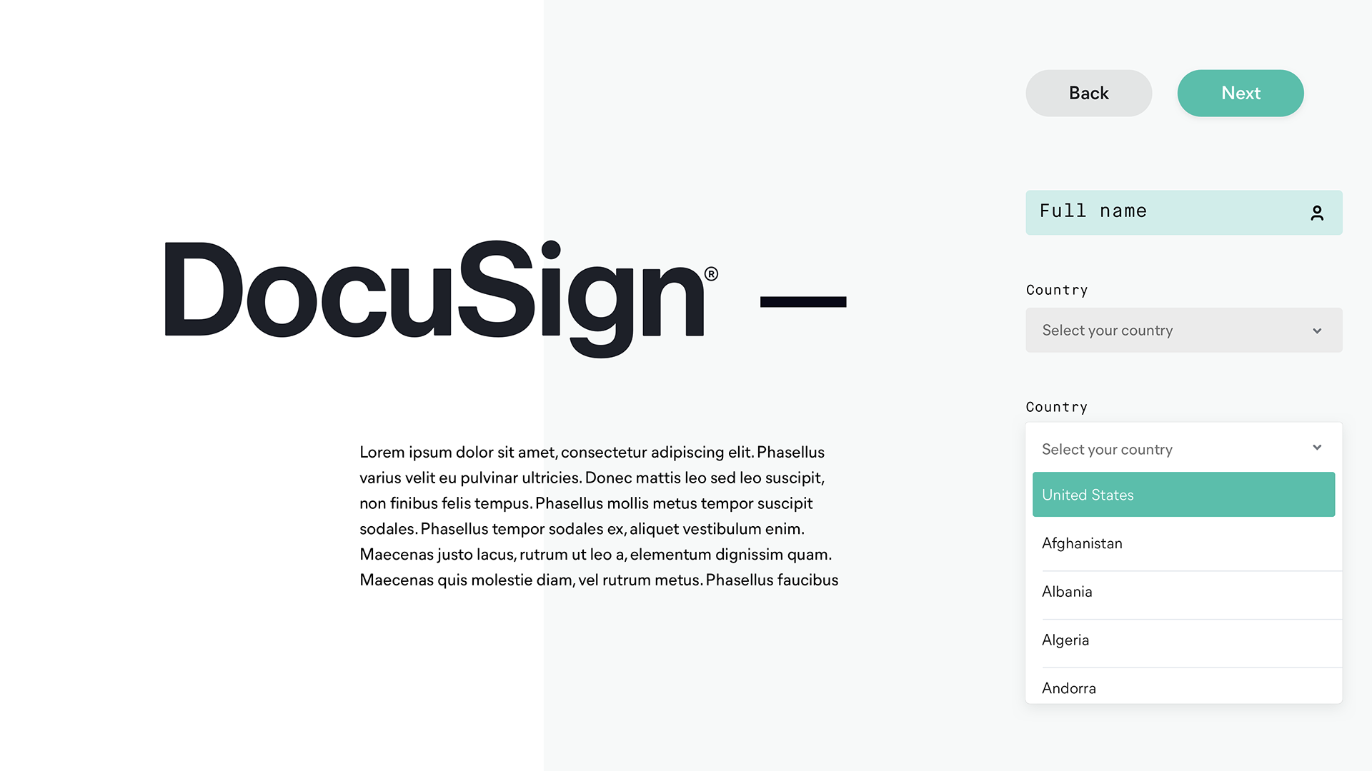
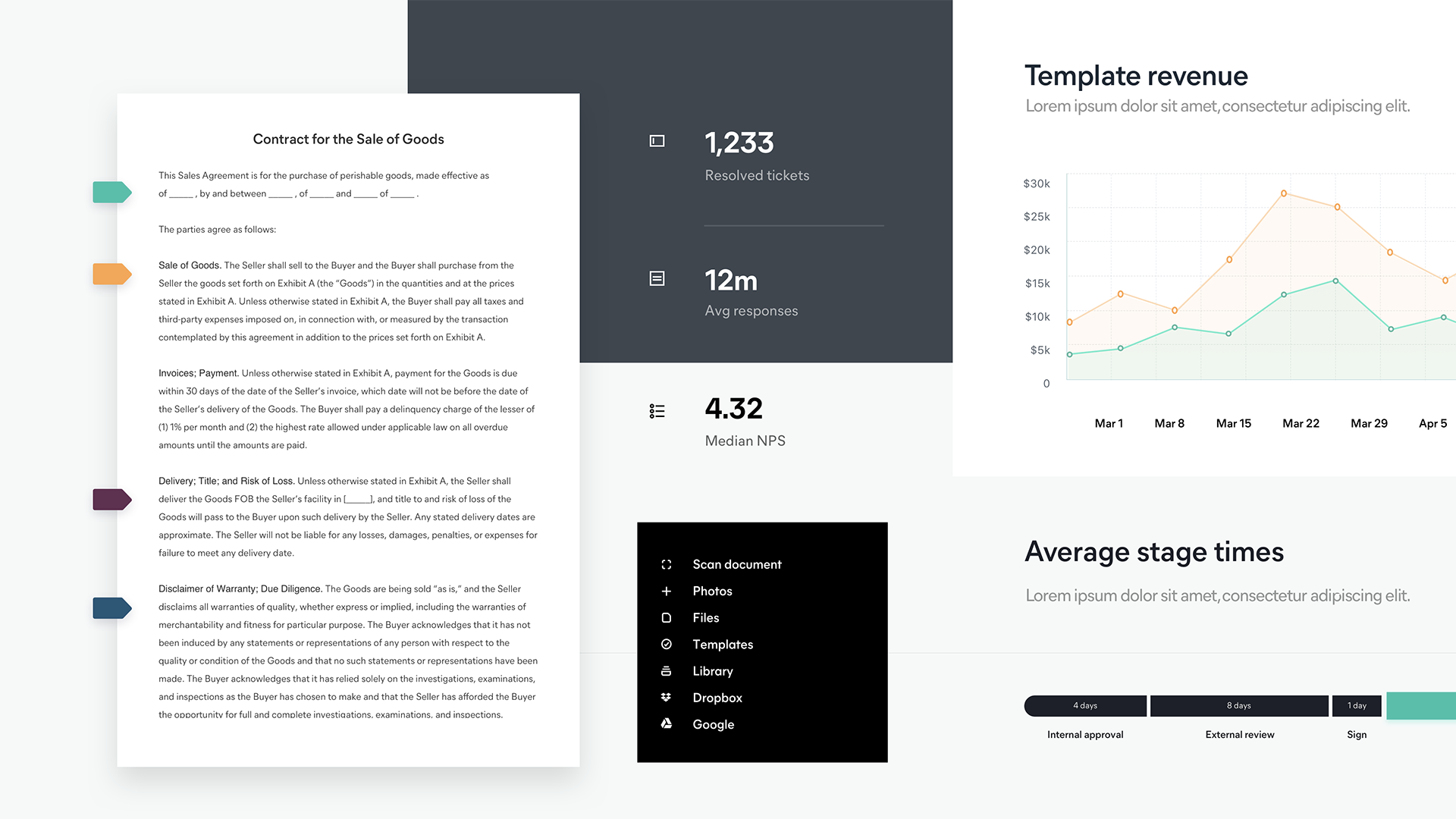
Poly’s color palette was ultimately a bit too pastel and playful. However people were drawn to the black UI elements and the editorial nature of the mobile screen example. So we took those elements and came up with another direction named Paper.
Paper was well received, however there was questions around some of the colors in the palette. We refined further leaning into the editorial direction. Utilizing a blue tone as the hit of color for actions. The blue was a nod to previous DocuSign blue along with being vibrant and accessible.
Stakeholders unanimously approved of this direction. Afterwards we began to socialize with cross-functional teams. This work set the Northstar and foundational direction in which we would then begin to create product concepts and ultimately begin design and developing the component library.


